Usability is one of the numerous elements to take care of in a website localisation process. Besides words and pictures, the design, layout and finally an analysis of the different ways different cultures may have to perceive the same content are crucial.
Adapting the design to the target language and culture
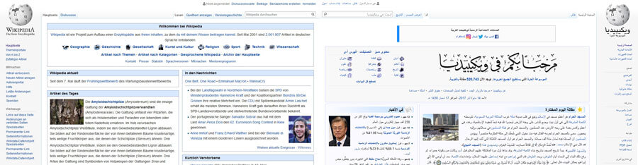
When we think about localisation and usability, the first thing that comes to mind is generally the writing direction. Left-to-right and right-to-left languages have to adopt different layouts.
For example, an English website localised to Egyptian Arabic will see its content mirrored in the process. Thus, the logo will be placed on the top right instead of the top left, the right-hand sidebar on the left-hand side, etc.
But the layout doesn’t only depend on the writing direction. Chinese-speaking people write from left to right, but are more used to looking for a right-hand sidebar, whereas Westerners look almost exclusively at the left-hand side of the screen.
The design can also be reconceived in a totally different ways, depending on the perception habits in the target culture.
Knowing how the target culture tends to internalised what is perceived is indispensable for effective localisation, as always. Westerners will immediately perceive the main blocks of a layout, whereas for Asians cultures, it will rather be seen as a sum of details. This can make a great difference, and is a criterion for success – or failure, if not carefully handled. This is especially true for e-commerce websites.
A well-internationalised website will be easier to localise ergonomically
A localised website layout must also allow for text expansion, which is virtually inevitable during a translation process. Different languages can indeed take different amounts of space!
Field sizes in forms, menus and buttons have to take this into account, lest you find yourself with plenty of overflowing text… Conversely, it should also be noted that some languages can sometimes take up less space than the source text. Such is the case, for example, when translating from an alphabet-based writing system to a logogram-based one.
Internationalisation is always invaluably helpful for avoiding repeating the same ergonomic changes with every new localisation!
All graphic features may have to be localised for an adapted usability
We all know that colours have cultural connotations and meanings. But we often forget that it’s not just the colours in pictures or backgrounds, but also in information or alert messages, for example. A red pop-up can mean an error notification in some cultures, but may not be understood as such in others.
We take great care when localising pictures, but let’s not forget to localise icons and symbols too! A “home” house-shaped icon to link back to the homepage only works for languages in which it is actually called a “homepage”. A French flag to signal the French language selection only works for French from France and would be inappropriate on a Canadian or Belgian website.
Taking the local technical resources into account for a better user experience
Some more technical aspects can also be part of ergonomical considerations. For example, a Facebook sign-in option works well in the United States, but not in a country that doesn’t use Facebook as much, like Russia.
Heavy visuals and functionalities would be inadequate in a country or region where Internet connections are irregular or slow. Likewise, a desktop-oriented website is ill-adapted for users who live where smartphones are the main or even the only means of access to the Web, as is the case in many African countries.
In conclusion, we can say that the localisation basics are always the same in the end: Know your target and make sure to adapt every single aspect of your product to it, to the greatest possible extent! For usability purposes, user tests can be a great solution to ensure that the target group’s habits are observed.