To better understand the meaning of this article, we must first of all define what color is.
Color is the property attributed to light or visual perception that allows us to differentiate
objects. Color is one of the most powerful components in the graphic design language. It
influences us by conveying energy and giving diversity to what we perceive.
Color also serves to focus attention, group elements and reinforce meaning, identity and
harmony.
Color increases interest in any visual element and helps to understand and prioritize
information. It arouses emotions in people and can participate in the psychological reaction
to a message. For example, light colors tend to bring a feeling of joy, while darker colors lead
to appeasement.
Colors carry subjective messages. For this reason, they must be used intelligently and
carefully in graphic design. Here are some of their meanings:
- Red: fire, blood, anger, love, danger, prohibition
- Blue: ice, sea, sky, social, wisdom, melancholy
- Green: nature, medical, concentration, stability
- Yellow : joy, warmth, knowledge, lies
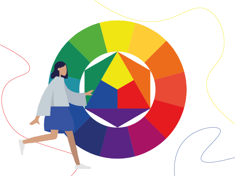
Colors have three basic visual properties:
Hue: color in its pure form is identified by the hue (red, yellow, blue…). It is a characteristic
guided by the way we see the light when it is reflected by an object.
Value: also called brightness, the value designates its intensity. For example, adding white to
a color produces a lighter value. Conversely with black. The value contributes to the
dynamics of the visual and the emotion conveyed by the message (lighter or darker).
Saturation: this is the brightness of a color. The degree of saturation measures the purity of a
color. For example, we can say that a saturated color is vivid and intense, while a
desaturated color seems blander. The colors called saturated tend to attract the attention of
the observer. Desaturated colors can be used when function and efficiency take precedence
over everything else. Caution should also be exercised when using an accumulation of
saturated colors, as they can make the message unreadable and tire the viewer. It’s all about
balance.
Some definitions :
Primary colors: yellow, red and blue. They are said to be pure and cannot be obtained by a
mixture.
Secondary colors: they are created by combining two primary colors. For example yellow +
red = orange / red + blue = purple / young + blue = green
Tertiary colors: they are created by combining a primary color with a secondary color.
Complementary colors: colors are said to be complementary if they are located on opposite
sides of a color wheel. When they are mixed, they neutralize each other. This is for example
the case of red and green, blue and red or yellow and purple. These colors, when
juxtaposed give an impression of intensity.
Monochromatic colors: they are created from different values of the same color. They are
obtained by adding black or white. Visuals based on these colors are perceived by the
observer as homogeneous.
Adjacent colors: they are identified as similar or neighboring colors on the color wheel. They
allow to create homogeneous and more varied visuals than with monochromatic colors.
Triadic colors: it is a set of colors formed with three equidistant colors on the color wheel.
Quadratic colors: it is a set of colors formed with four equidistant colors on the color wheel.