By definition, visual communication is the practice of graphically representing information to efficiently and effectively create or convey meaning. Technical communicators can enhance the usability and readability of their technical documents by utilizing visual elements.
Visual communication can appear in various forms including illustrations, infographics, interactive modules, motion graphics, animations and other methods of data visualization. This article will discuss one of the most commonly used visual communication methods – infographics.
What are infographics?
Infographics are a method for visually representing information through different data sets and images. Companies, organizations, and researchers use infographics to break down and explain dense, lengthy, or complex information. The use of infographics also eliminates large chunks of text and replaces it with visually appealing models.
Infographics are commonly used because they not only communicate and highlight the main ideas, but they also promote memorable associations between the facts and visual elements. These associations help increase the amount of information retained, while decreasing the amount of time the audience needs to invest in understanding the information.
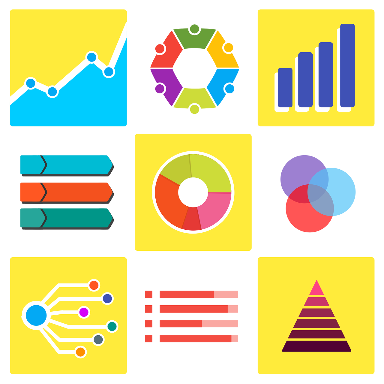
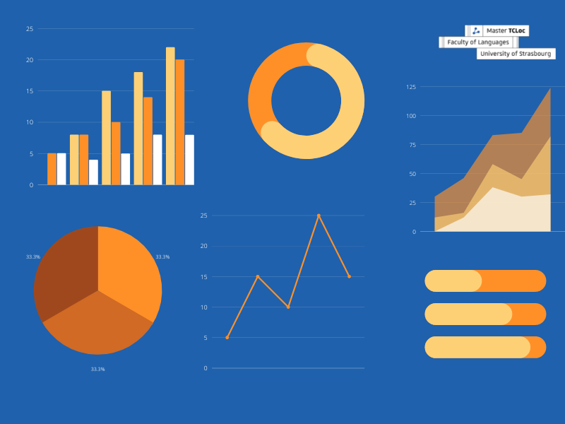
Some infographics utilize bar graphs and line charts to display numerical data, while other infographics utilize diagrams, shapes, or a list format to communicate a process or relationship.
Infographics’ role in technical communication
The constraints that technical communicators face often influence the method used for conveying information. For instance, technical communicators must consider time constraints such as the deliverable’s deadline and the amount of time that an audience can or will invest in your topic. Other factors that you must consider include your audience’s interest, familiarity, connotations, and environment in which the audience will receive the information.
Infographics provide a useful medium for appealing to audiences who are unfamiliar or who may have negative associations with your topic. This visual communication method can also provide an overview or a warning on something that might be too lengthy or complex to explain within a technical document. For instance, the use of infographics within a chemistry lab can quickly remind individuals of how to or how not to use certain chemicals and equipment.
In general, infographics help technical communicators engage, inform, persuade, and motivate audience members.
Developing an infographic
All infographics should include graphical elements that develop the overall message through the conscious consideration of the theme, font, main points, colors, and layout.
Below are some questions that can help guide technical communicators during the design process.

- Who is my target audience(s)?
- How familiar is my target audience with my topic?
- Do I clearly provide background information, context, and definitions as needed?
- Does my design provide an overview of my topic and answer basic questions?
- Does my design cater to presentation constraints (i.e. time)?
- Are my visual elements (i.e. charts and graphs) easy to understand?
The less familiar an audience is on a given topic, the more information or context the technical communicator will need to provide. For unfamiliar audiences, remember to avoid jargon or highly technical terms as the audience is more likely to become confused and uninterested.
Characteristics of a good infographic
Infographics are used across many fields to quickly inform one or more audiences. Since infographics will vary based on the objective and audience(s), consider using the checklist below when creating and revising your design.
- Infographic has a clear purpose
- Infographic has a clear audience(s)
- Information is concise (only the key ideas or important facts are included)
- Text is limited (only used to label, explain, or enhance visuals)
- Sources are cited (as needed)
- Visual elements are self-explanatory
- Layout includes an appropriate amount of white space (information is not crowded)
- Theme (headers, colors, font type, and font size are consistent)
It is important to remember that the graphics should communicate a majority of the facts while text is used to supplement the visuals. Remember to use colors, headers, text, and typography to emphasize the most significant points or details.
An infographic should only communicate essential information with an easy-to-understand overview of a topic.
Conclusion
Infographics are very efficient because they support clear and quick communication. An infographic informs and helps the viewer to translate raw data into meaningful information. They grab an audience’s attention and effectively involve and engage the audience. As you consider your next project, decide if an infographic can help you more clearly communicate your ideas.
Are you interested in technical communication? Don’t hesitate to have a look at the TCLoc Master’s Program to dive deeper into these topics!
Edited by Madison Brown.