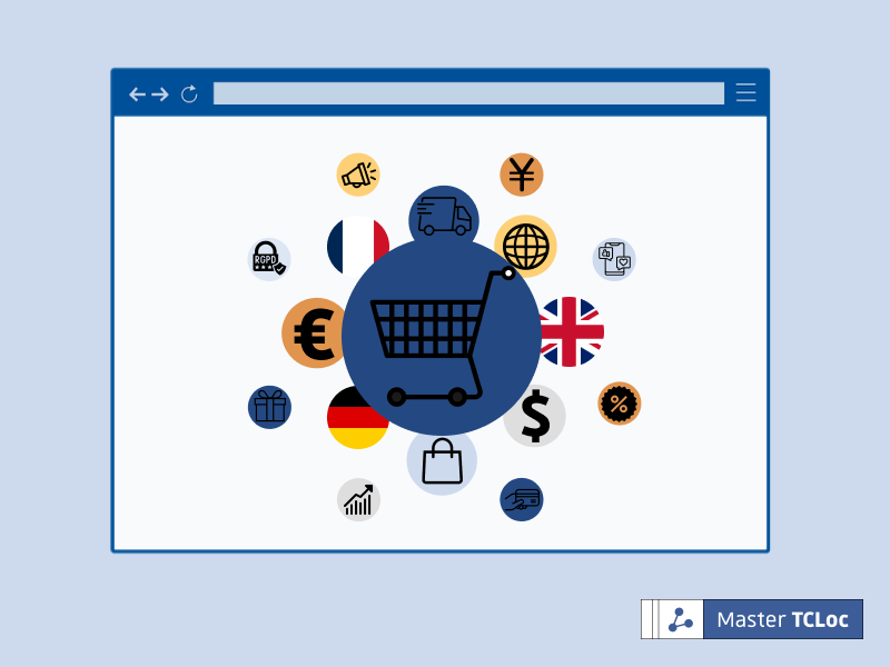
Choosing colors for a website is about more than aesthetics and preferences. Color can determine how users engage with your website and perceive your brand. Learn how to harness the principles of color psychology in UX design.
In web design, color plays a much larger role for the customer than simply forming first impressions. Color choice is an avenue of communication utilized by marketers to attract a specific type of consumer and build a brand. Not only is strategic color design a great way to engage an audience, but it should also embody the essence or values a company may want to convey to the public. There is even a field of study that looks at how people react to colors: color psychology. In UX design, color psychology primarily deals with how color affects people’s responses to a website. While there are no concrete rules on what a website should look like, some principles of color psychology can be applied to UX design to ensure a positive and professional experience for website users.
Understanding Color in UX Design
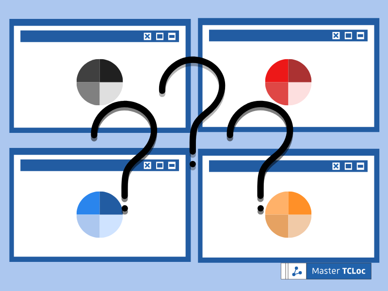
Having a dominant color that can be found on all marketing material and company documents is crucial for building a brand’s image. Once a company selects a primary color, one or two additional colors should be added to create a color palette. Although it is not advisable to use more than three colors within a palette, variants (several shades of the same color, for example) may be added to create a fuller look. Traditional company palettes are generally composed as follows:
UX design follows some general color principles. Websites typically employ two primary colors that work in tandem to create a contrasting look. This usually entails one neutral, darker shade as the background, while the other shade is dynamic, light, and eye-catching. Vibrant colors should be used sparingly to draw attention to key parts of the site, while the more muted colors should be used liberally to create a cohesive look.
Before moving forward, it is very important to note that the perception of color varies from culture to culture. While most western countries view white as a symbol of purity and health, Chinese audiences might view white as the color of mourning. These divergences in perception can vary significantly across every culture and the entire color spectrum. While this article focuses on the western color psychology, it is a good idea to make a website’s UX as accessible, versatile, and multiculturally applicable as possible.
Conveying Meaning Through Color

The color red possesses many, sometimes contradictory, meanings. Although red is typically associated with love and passion, it has ties to rage and danger as well. Because of this, red is a focal color for emergency and relief services. It is also frequently used as a key shade in fast-food chain color palettes because of its symbolic attachment with intense sensations such as hunger.

Many consider orange to be a welcoming color that exudes energy and individuality. It promotes feelings of community and sharing, and it is often a popular color in marketing, online sales, food, or event industries. These industries select orange as a primary shade for their company because of its liveliness and vibrant nature.

Yellow is an energetic color that is representative of light, joy, optimism, and childhood. Its use is suited for the marketing of toys or objects related to youth. It is also especially popular as an accent color, used to infuse energy or liveliness into a brand’s color scheme. Yellow is rarely seen as the primary color on a website because it washes over other colors and tires the eye quickly.

Pink is typically associated with femininity and romance. Generally, products marketed with this color are directed towards a female consumer. This color can be found in makeup, beauty, and wellness marketing. It is also has strong ties to breast cancer awareness, and is a marked color within the feminist movement.

Contrary to the more vibrant colors, brown is a rather reliable color. It often embodies friendliness and environmental consciousness. Due to the associaiosn brown has with practically and reliability, it is seens frequently in shipping companies. This color can often be found in furniture marketing because of its rustic, sturdy appearance.

The most common color among websites is blue. Its darker tones bring softness and calmness, while its lighter tones create an aura of sleekness and intelligence. However, too much use can give the impression of coldness, even depression. Banks, insurance companies, and social networks usually incorporate this popular color for blue’s ties to trust and loyalty.

Much like brown, green is associated with nature. While it typically produces an feeling of harmony and success, it can also refer to evolution and growth and is most often used to accent the ecological or ethical side of a brand. Companies revolving around outdoor work, hunting, or organic products implement green to attract their target audience.

Due to its richness, companies like to utilize purple to inspire a sense of luxury. In addition to this, it tends to invoke a feeling of mysticim and imagination. This is a color recommended for marketers targeting a spiritual audience. It is often seen on astrology, crystal, or spiritual websites.
For a sleeker look, some companies opt to create a website solely in shades of black and white. In just the right dose, these colors allow a sober and elegant effect.

Commonly used in the background and accompanied by a brighter color, black brings a touch of sophistication to a site and can be combined with any color. Although it is mostly used for vehicle and technology companies, this shade is versatile in nearly every context. Therefore, black appears il the websites of almost every industry.

Websites integrate gray or shades of silver because it brings a polished appearance, along with an air of professionalism. Gray is rarely used as a primary color for a website but rather an accent or alternative to its more intense shades, black and white. Conversely, silver appears is almost always used as a primary color for websites that target a more expensive look, like vehicles and jewelry brand.

Another frequent background color is white. A website designer may be more inclined to select a white background if their website includes many colorful visuals. This layout allows for sites that features more photos (such as travel blog, hotels, or resorts) to maintain a sleeker look while integrating colorful images.
How to Choose the Right Colors for UX Design
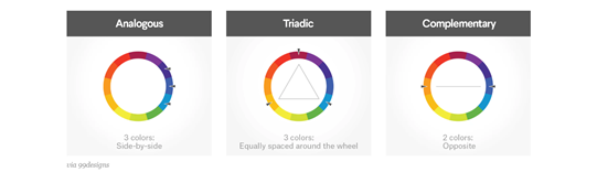
The color pairings chosen by web designers are not thrown together at random. Rather, there is a method to what color schemes are complimentary, from both an aesthetic and marketing standpoint.
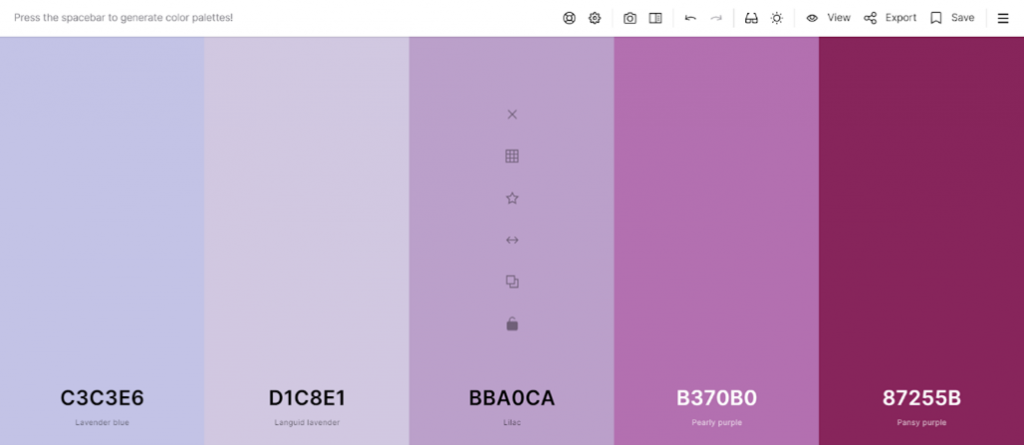
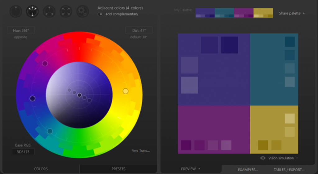
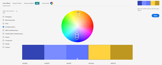
There are several softwares that assist UX designers in choosing the correct color palette for their website. Some convenient softwares that assist in the color selection process are Coolors.co, Paletton, or Adobe Color. These aids provide the user an easy-to-navigate interface that offers endless color combinations. After selecting a primary color for the website, the softwares listed above will provide an array of combinations that compliment the orginal selection. These software are great starter tools for beginners in website design.
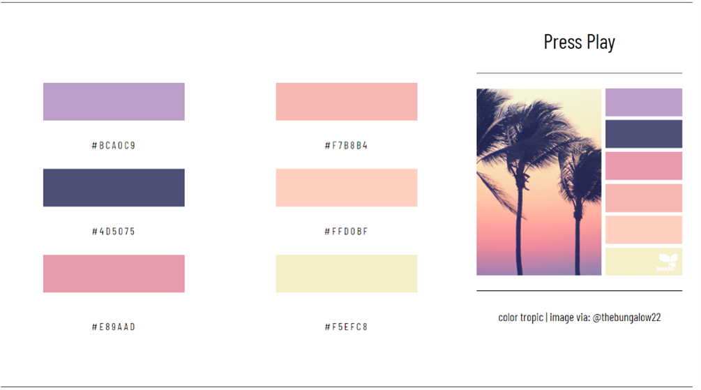
Pulling Inspiration From an Image
In another genre, it is also possible to be inspired by the colors of a picture. Indeed, this technique will bring you a very simple and natural color palette, but also a glimpse of the marriage of colors between them. First of all, you can select one of your pictures that you like and, with the help of a photo editing software (such as Photoshop for example), extract a few colors from it. If you wish, you can also get inspiration from the designs already created, such as in the Design Seeds website. A photo with a selection of 5 colors is proposed to you according to themes, seasons or colors.
If you found this article on UX design and web development interesting, then you can learn more by checking out the TCLoc Master’s blog for more articles on this topic.
This article was edited by Ella Goodwin and Cameron Van.