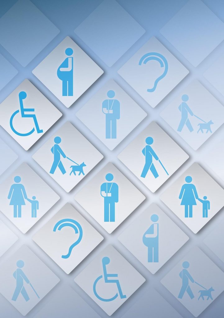
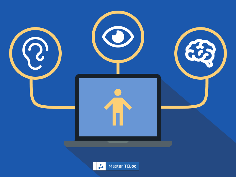
Digital accessibility is about ensuring that all of the people that visit your website, including those with disabilities, can navigate your content without barriers and find the information they need. Read on to find out more about the basic principles of digital accessibility.
The Web is for everyone, regardless of where they live, how old they are, what language they speak, and regardless of their mental or physical abilities. However, many websites contain barriers that make them difficult to use for people with disabilities. Digital accessibility is about removing these barriers.
A number of governments around the world are increasingly recognizing the need for digital accessibility through laws and regulations, making accessibility not just an option, but a requirement for many websites. It has therefore become even more important for website creators to be aware of digital accessibility principles.
What Is Digital Accessibility?
The Cambridge Dictionary defines the term “accessibility” as “the fact of being able to be reached or obtained easily” and as “the quality of being easy to understand”. Therefore, if something is “accessible” it can be used or understood freely, without any constraints.
In an ideal world, all internet users should be able to freely and easily browse the internet. Unfortunately, for many people with disabilities as well as for older internet users, the degree of accessibility for websites and apps can be very low. Any disability can have a potential impact on the user experience, ranging from minor inconveniences to the inability to use a website at all. This includes visual, motor/physical, auditive, as well as cognitive and learning disabilities. For example, as the Web is a highly visual medium, blindness and vision impairment can prevent users from being able to navigate websites and access information.
How to Make a Website Accessible
Use the Web Content Accessibility Guidelines (WCAG)

The Web Accessibility Initiative (WAI) developed the Web Content Accessibility Guidelines (WCAG) to promote digital accessibility and set standards that websites must fulfil in order to be labelled “accessible”. The WAI furthermore helps organizations implement digital accessibility in their websites by providing technical specifications, educational resources, and examples of good practices.
As of spring 2022, the most up-to-date version of the digital accessibility criteria is WCAG 2.1. Based on these guidelines, this article provides an overview of some general good practices to keep in mind when creating websites.
Conversely, if you already have a site and would like to know how accessible it is, you might also consider testing your website to find out its accessibility score.
Think About the Design of Your Website
The design of a website is a key component of digital accessibility. This includes the use of colors, visual elements, and layouts. Using highly contrasting colors can make content more visible to users with low vision. It is also a good practice to avoid the combination of red and green, as red/green color blindness is a common form of color blindness.
People with disabilities can use assistive technology that help them navigate the Web. One example are screen readers. Screen readers read the text on a website out loud and are therefore especially helpful for people with visual impairments. Screen readers also read image alt texts. Images and other visual elements included on a website should therefore have appropriate alt texts describing them.
One way of quickly creating a multiple column layout on a webpage is by using tables. While these tables are invisible on the front-end, they cause difficulties to people using screen readers. Screen readers encountering a table will inform the user of the various columns and rows encountered on the page instead of simply reading the content. Using tables simply for layout purposes should therefore be avoided.
Structure Your Content and Make It Easy to Read
Another principle of digital accessibility is properly structuring web content. Screen readers can scan a page for headings and hence create an overview of a page’s content for users to orientate themselves by. However, screen readers can only identify headings if they are properly ascribed the title tags <h1>, <h2>, etc. It might be tempting to choose headings based on stylistic purposes, such as using italics to indicate a heading or skipping heading levels by going from an <h2> to an <h4>. To avoid confusing screen readers, heading levels should be strictly in order and should serve the purpose of organizing content into a logical structure.
On an accessible website, content should ideally not only be easy to navigate, but also easy to understand. This can be achieved by avoiding long and complex sentence structures and jargon and slang. When acronyms are first introduced, they should be written in full and glossaries can be provided to explain specialized terminology. Applying simplified writing techniques not only benefits people with learning disabilities, but every user visiting your site.
Take Into Account Navigation and Interactivity
Some users who cannot navigate with a mouse rely on keyboard commands to browse the internet. When creating an accessible website, it is therefore important to ensure that it can be navigated easily with a keyboard. Menus are a main axis of navigation. It should therefore be ensured that each item of the menu can be accessed with a keyboard. Some menus have a “flyout” functionality, which reveals sub-menu items through mouseover. In general, elements that are only revealed and/or clickable through mouseover should be avoided altogether.
It is also a good idea to provide additional points of navigation, such as a sitemap and breadcrumb menus. In order to make long or complex pages accessible, “jump to” anchor links can be added to allow users to more easily navigate between content sections.
Screen readers can also be set to identify all the links on a page. It is therefore important that links be given descriptive names, as someone using a screen reader may not alway be able to read a link within its context. A link that reads “Read our FAQs” is for example more descriptive than “Click here” and will allow the user to more easily identify what they are looking for.
Towards a More Accessible Digital Future
Digital accessibility is about making sure that everyone can use websites, regardless of their physical or mental abilities. This need is also increasingly underlined by governments and it is therefore important to build websites for all users. In addition, implementing digital accessibility principles, such as highly contrasting colours and easy to understand language benefits not only people with disabilities, but improves the user experience for every user.
Would you like to learn how to create websites? Be sure to check out the TCLoc Master’s program, a distance learning master’s degree that combines technical communication and web technologies.
This article was edited by Janna Mack.


