Did you know that 16% of the world’s population experience some form of disability in 2023? It is crucial to consider web accessibility when creating content today. In fact, many countries have legal requirements to maintain digital accessibility. This concept encompasses many disabilities and factors, one of which is dyslexia. This article will focus on dyslexia-friendly/readable fonts and explore how incorporating them improves UX for every user.
Definition of web accessibility
Web accessibility is designing your web content accessible for everyone regardless of their disabilities or limitations. The subject doesn’t limit to dyslexic users but also to other sectors: neurological impairments, visual, hearing, physical, or neurological difficulties, seniors, people with technical disadvantages, non-native speakers of the target language, and more.
Web Content Accessibility Guidelines (WCAG) is the global standard for web accessibility. Released by the W3C Web Accessibility Initiative (WAI), Web Content Accessibility Guidelines (WCAG) 2.1 states the following as principles which are also known as POUR:
- Perceivable
- Operable
- Understandable
- Robust
Definition of dyslexia
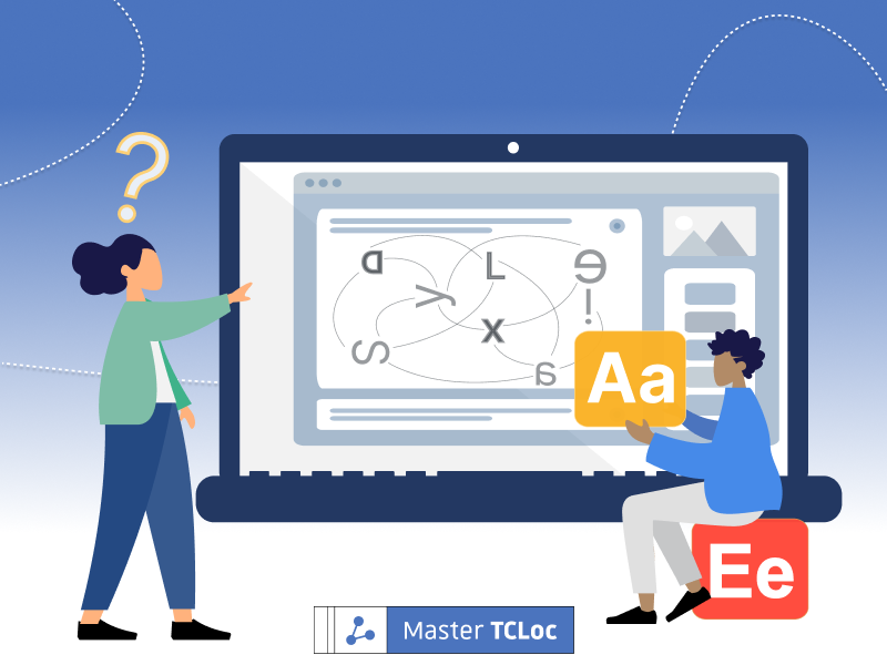
Dyslexia is a neurological condition that affects the individual’s spelling and reading. In the UK, at least 10% of the population is influenced by dyslexia. As NHS defines it, it is “a learning difficulty” that doesn’t directly affect the person’s intelligence. However, their performances (especially at a young age, like at school) can be challenging without the correct understanding and sufficient support from others. One of the possible solutions is choosing more readable fonts.
Which fonts are more readable?
What makes a font more “readable” for the dyslexic audience? Dyslexia Style Guide by The British Dyslexia Association explains the ideal choice is sans serif (Arial, Comic Sans, etc.), a typeface without minor decorating strokes on longer lines. By this characteristic, sans serif fonts make each letter more distinguishable.
In Japan, a digital font software company Morisawa developed universal design (UD) fonts in 2009 to increase legibility and readability for wider audiences. The board of education of Ikoma city in Nara, Japan, introduced UD fonts in all elementary schools & junior high schools in the town after a survey proved that UD fonts boost pupils’ correct answer rate in a Japanese test by 15%. More and more companies, local governments, and educational organizations are using the UD fonts, and it is now available in 4 languages (Japanese, English, Chinese, and Korean).
Other vital elements in readability
However, it is vital to note that switching fonts won’t singlehandedly achieve inclusiveness. They can serve their purpose when combined with other considerations, such as:
- Appropriate font size (12-14 points)
- Appropriate inter-letter, -word, and -line spacing
- Use bold to emphasize and avoid italics and underlines (It also has to be implemented in combination as a whole)
- Consistent and clear structure
- Colour contrasts
- Precise delivery of a message
- Audio support option and more
These principles overlap with Web Content Accessibility Guidelines (WCAG) 2.1, and you can read how Google implement these into their typography.
Also, you can try a Chrome extension such as Helperbird and see how supporting features help users to navigate the web pages.
Conclusion
Web accessibility strategy consists of many aspects and involves various roles if you’re working as a team. It requires careful examination and constant updates, but fonts can be a good starting point.
Thank you for reading, and we hope this article was helpful. Find more articles on web accessibility here!