Why are colors so important in web …
Visual elements are processed by the brain faster than text, and 90% of the information transmitted is visual. It is a well-known fact: when someone arrives on a website, you only have a few seconds to make them want to stay, and colors can help you with that. But colors also have other purposes: they can help deliver a message quickly, set a whole atmosphere, or even just help to make your content more attractive. People assign importance to colors because an adapted color palette can make all the difference! But besides finding harmonious colors that stick to your content, another important point must be kept in mind: to make sure your colors are visible to everyone. With at least 1 billion people living with some form of disability in 2021 as estimated by the World Health Organization, web accessibility has become essential in an era where digital leads. To help create accessible content in terms of choosing colors, useful techniques and tools have been created.
The meaning behind color accessibility
Web accessibility is the process of creating and designing websites that can be used by everyone including people with disabilities. Disabilities have different levels of severity and can have multiple impacts on someone’s way of living. As its name suggests, color accessibility is the fact of using colors that can be seen by the widest range of people. This means choosing colors with a lot of contrast, for example between the content and the background so that anyone can clearly differentiate the two of them and easily read your text.
Color blindness, glaucoma, low vision, etc. are several disabilities affecting visual perception. Choosing color with the right criteria for everyone to see them can make a huge difference on the navigation and comfort level of people when seeing and/or reading your content. Color accessibility is not only good for users, but it also allows you to reach more people including those with visual disabilities.
Checking the Web Content Accessibility Guidelines
The WCAG, Web Content Accessibility Guidelines, was published by the Web Accessibility Initiative (WAI) of the World Wide Web Consortium (W3C). These guidelines were created to ensure that web content is accessible for everyone, despite their abilities, disabilities, and used devices. Even though the WCAG is not mandatory in every country, a lot of them are allowing people to sue websites that did not meet the WCAG standards for discrimination. Moreover, it is, in any case, recommended using the WCAG to ensure the best color accessibility.
In order to meet the WCAG’s standards, one key element is to have the text and interactive elements with a color contrast ratio of at least 4.5:1. Such a wide contrast ratio will ensure that almost everyone will be able to read any text even people who cannot see the full-color spectrum. To make it easier for you to check whether your color palette respects the contrast ratio or not, contrast checkers can easily be found online, for example, the WebAIM Contrast Checker or Adobe Color.
However some specific elements may not need to follow the 4.5:1 ratio rule:
- Any text of 14 pt bold or larger, as well as 18 pt text and larger, should have a ratio of at least 3:1.
- Brand logos
- Subsidiary text and text images which are used as decoration and do not serve user purpose.
The key part: understanding color contrast
As you have just read, color contrast is one of the key criteria to ensure color accessibility. However, even with the existence of several online tools, is it recommended understanding how color contrast works.
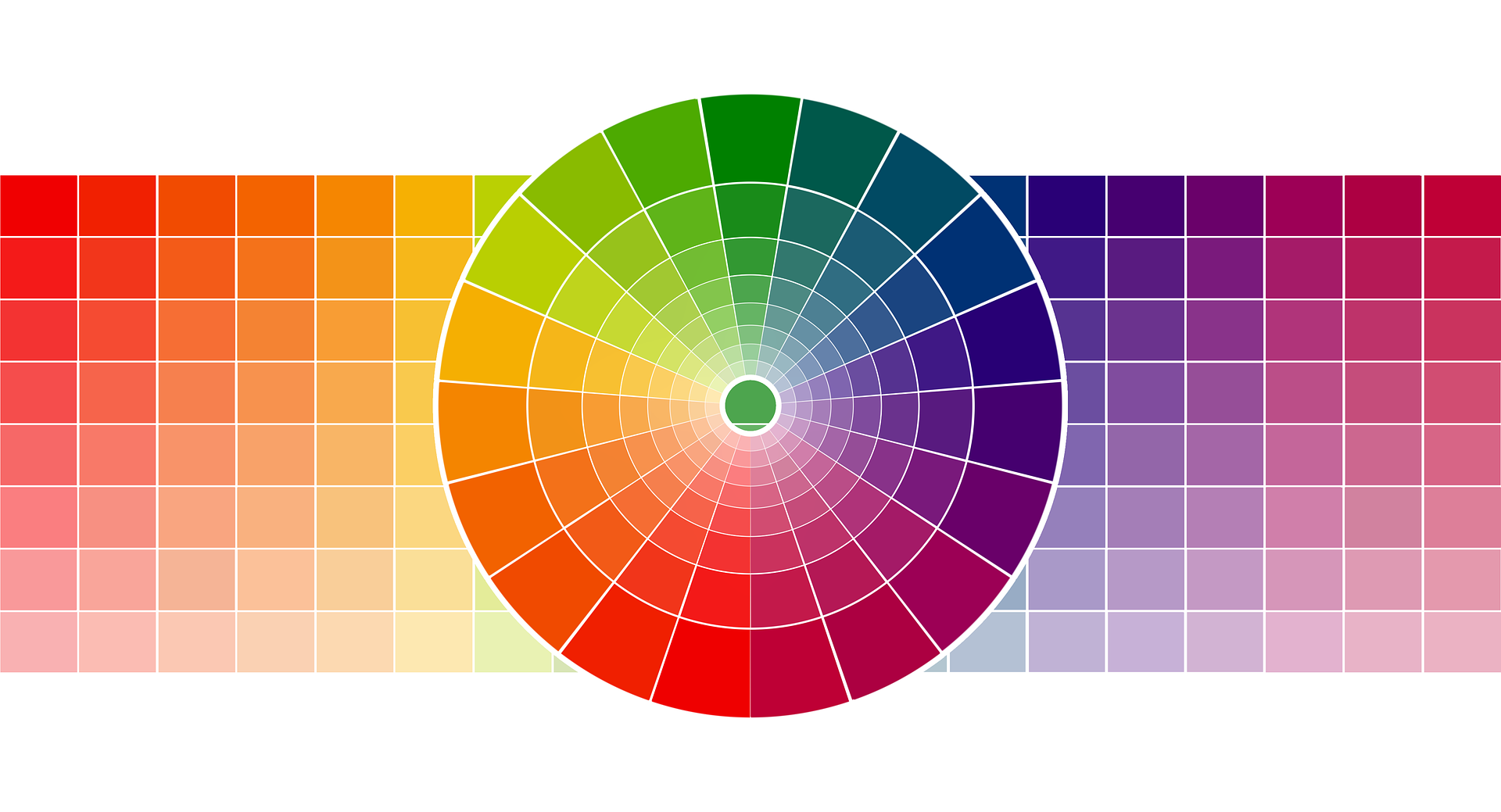
In web design, color is used to make something stand out from the rest. To do that, you have to decide how much you want your element to stand out and in relation to which other elements. That is roughly the definition of contrast! Contrast is how you are using colors to differentiate elements from one another. Color contrast can be low when using an analogous color scheme or high when using opposite colors on the color wheel.
analogous colors :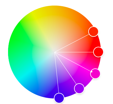 opposite colors :
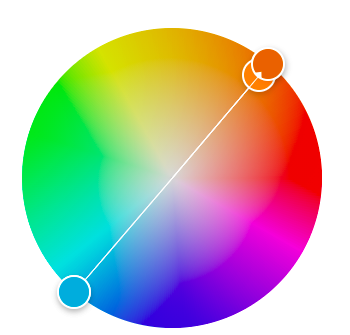
Best practices for color accessibility
Even though color contrast is one of the biggest criteria in color accessibility, several elements should be taken into account to ensure that the widest range of people can clearly see your content.
- Ratio: you should have a color contrast ratio of at least 4.5:1 for text and interactive elements.
- Color blindness: avoid using color blindness combinations like red-green or cyan-grey.
- Indicators: interactive elements must not have color as their only indicator so make sure to add others like underlining links on hover.
- Written style: colors must be written in formatting code like CSS so the accessibility can be accurately measured. Black and white are also included in this rule.
Color is not the only aspect to consider in order to make content accessible to everyone. Color accessibility is only a small part of web accessibility, that is why a lot of different aspects must be taken into account when creating a website that can be easily used by everyone.
Ressources
- https://en.99designs.ch/blog/web-digital/color-accessibility/
- https://altitudemarketing.com/blog/color-contrast-web-design/
- http://web-accessibility.carnegiemuseums.org/design/color/
- https://xd.adobe.com/ideas/principles/web-design/color-contrast-considerations-accessibility-design/
- https://www.techsmith.com/blog/why-visual-communication-matters/#:~:text=Visual%20communication%20results%20in%20better,brain%2C%2090%25%20is%20visual