Meet Serge, the reckless French bunny that improved child safety in trains and accidentally made a statement about technical communication.
Safety signs are a core element of technical communication as well as a source of growing concern. Our lives are increasingly swamped with machines, devices, chemicals, energy, and speed—all of which provide great benefits, but also involve substantial risks. Consequently, as the technical communicators of tomorrow, we need to grasp these issues and put in place the relevant warnings to protect people from danger.
For decades, technical communication regarding safety has mainly targeted consumer goods and particularly the industrial sector, where workers face multiple risks under the pressure of productivity requirements. As a result, useful guidelines and regulations on safety notes and warning messages have been developed, implemented, and refined, such as the European Machinery Directive 2006/42/EC or the ANSI Z535 and ISO/IEC 82079-1 standards.
The challenges of communicating safety hazards
What makes hazard communication so difficult?
As far as hazards are concerned, such guidelines often recommend using standardized pictograms and texts to provide consistency, conciseness, simplicity, and comprehensibility across cultures and contexts. Lately though, a growing emphasis has been placed on adapting such standard messages to different target audiences, contexts, and reading conditions (as in tekom’s “Safety Notes and Warning Messages.”) After all, warning signs do not concern solely consumer products and workplace safety (already subject to a remarkable degree of standardization), but also public spaces and facilities. With equal importance, warnings are not always directed to trained workers or consumers in top form. While young children or elderly people will probably never use a steel press or an industrial oven, they may well step on slippery surfaces or go through heavy automated doors regularly. Consider, for example, the multiple hazards that plague public transportation.
Safety signs in public transportation
So, how do conventional safety signs fare in settings like public transportation? On the one hand, mass transit involves obvious risks such as turnstiles, moving vehicles, power, opening and closing doors, going up and down, in and out. On the other hand, commuters include people of all ages, conditions and impairments, often busy or in a hurry. The result is a minefield for technical communicators: multiple dangers to warn about, different audiences with specific needs, and the requirement to be simple and concise.
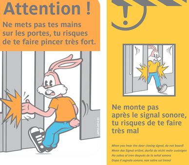
Now, think about children. They are curious, restless, easily distracted, and very often either unable or unwilling to read. Write “Keep away!” and kids will already be too close; add a “Do not lean on the door!” sign and they will probably lean on the sign itself. Finally, children can never, ever, be expected to mind the gap. Luckily, very young humans are not the only funny little animals to board trains. In Paris, France, a rabbit has been getting his hand trapped in the subway’s doors since the late 1970s—all for child safety.
How can we adapt safety signs for children?
Hazard communication through cuteness
Our friend Serge was created in 1977 by Anne Le Lagadec (inspired by the endearing lack of prudence of her own pet bunny) and slightly updated afterward. From its very inception, this cartoonish and anthropomorphic rabbit has placed his hand in the wrong place, thus warning about the dangers of automated doors—and beating many expert technical writers in the process. These eye-catching stickers are placed at a medium height (around children’s line of sight), include a caution message (often in several languages), and are highlighted in visible colors, such as yellow, red or orange. Under the message, a visibly surprised and scared rabbit shows both the risky behavior (placing the hand on the door) and its consequences (getting trapped).
Hazard communication for children: Adapting the standards
So from a technical writer’s standpoint, what standards would be applicable to such a caution message? In principle, warning signs should stand out and include identifiable but abstract pictograms, coupled with a short text specifying the danger involved, its possible consequences, and the ways to avoid it. Nevertheless, when children are the main target group, signs should be adapted accordingly.
As suggested by a recent research project by Waterson, Pilcher, Evans, and Moore, warnings intended for children should avoid the high level of abstraction so coveted in other, more standardized contexts. According to this study involving 210 British children, conventional signs using abstract pictograms and short texts can be difficult or even impossible for kids to understand. In this sense, the authors make some recommendations to enhance awareness and comprehensibility of the warnings:
- Use colors to improve visibility and convey intrinsic information (red for danger, for example)
- Feature cartoon-like characters that attract the attention of children (such as animals or superheroes)
- Endow such characters with recognizable facial expressions
- Use the visuals to show both the cause and the outcome of the dangerous behavior in point
Therefore, we have a complex task ahead of us: assessing the specific needs of vulnerable groups and reconciling them with the existing restrictions and general guidelines.
Nonetheless, we should not be discouraged. Serge got it right on the first attempt more than 40 years ago and, funnily enough, straight from the pencil of an advertising designer! Little wonder this sticker has become an inspiration for safety signage and warnings in other public transportation systems, home and abroad.
Remember, mind the rabbit!