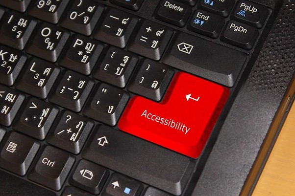
Web Accessibility is becoming more and more prominent in the digital realm – and that’s great news. Recognized standards such as the Web Content Accessibility Guidelines (WCAG) or the European Accessibility Act are pushing things in the right direction. What about technical documentation? How can technical writers make documentation more inclusive?
Why Does Technical Documentation Accessibility Matter?
Web Accessibility aims to make websites and other digital resources easy to access and to interact with, for people with a wide range of disabilities or socio-economic restrictions. When it comes to technical documentation, accessibility makes a lot of sense because everyone should be able to understand how the product they bought works and what safety measures need to be addressed. Therefore, accessibility practices should be applied from the beginning of the documentation writing process and not added at the end as an afterthought. Whether your technical documentation is digital or printed, many factors have to be taken into consideration to bring everyone on the same starting point.
Choosing the Right Font
Improving overall readability is one of the most obvious aspects of technical documentation accessibility, especially for people suffering from dyslexia. Picking the right font is a great place to start.
A study conducted by Luz Rello and Ricardo Baeza-Yates has shown that sans serif, roman, and monospaced fonts, particularly Helvetica, Arial, Courier, and Verdana are increasing reading performances of dyslexic people. Furthermore, the use of italic and underlining should be avoided. Emphasizing parts of the text in bold is, however, recommended.
In any case, larger fonts, high contrast accompanied by smart page spacing are proven to increase reading speed and make your page look much more neatly and clear.
Picking Colors Wisely
It is no secret to anyone, we do not see the world with the same eyes. Color blindness affects approximately 8% of men and 0.5% of women. To ensure a good reading experience for those suffering from a vision deficiency, using enough contrast between colors is essential. Black text on a whitish background is the best option for your main text.
Also, for obvious reasons, you should avoid using red and green to distinguish two elements, in a chart for example. Instead, try and add texture or other elements to make sure the legend is clear and people get the message.
Illustrations Are Worth a Thousand Words
In order to decrease the amount of text in your document, do not hesitate to add photos as well as other graphical elements. Not only does it vary the form of your message, but people might also be more receptive to an illustration such as an infographic rather than paragraphs of plain text. Of course, the previous tip on colors also applies here.
Moreover, if your documentation is available online, you should always pay close attention to filling the alternative text tag (“alt tag”). Be as descriptive as possible so that people equipped with screen readers or people with very limited internet access do not feel left out.
If this subject interests you, you should have a look at the principles of Universal Design for Learning (UDL) and the Gestalt theory. Both are great resources in terms of making visual content as interesting, clear, and accessible as possible.
Have a Minimalistic Approach
Over consumerism has led us to crave more minimalism in our lives. Technical writing is no exception. Being a good technical writer involves being able to leave out unnecessary details. Think “Enhance rather than distract”.
Going straight to the point leaves less room for misinterpretation. The goal is to provide documentation that people are able to understand and learn from. One way to do this is to simplify the document as much as possible. Here are a few tips:
- Use lists to structure your content. It avoids using sentences when they are not needed and allows the page to feel airier.
- Emphasize with boxes. Again, it is a great way to structure the information and isolate important parts of the text without adding too many distractions.
- Keep the layout simple. Using clear title hierarchy and indentations is a solid base. Then, one paragraph should not contain more than one idea.
- Avoid difficult words and jargon. Stick to simple language applying the Simplified Technical English (STE) standards. For instance, you should always favor the present tense and active voice.
We hope this article was helpful. Do you follow any accessibility guidelines when writing technical documentation? If you do, feel free to share your best tips!
Interested in reading more about technical communication? We have plenty more articles!
Sources:
- https://medium.com/level-up-web/choosing-fonts-for-technical-documentation-ee99e4d90499
- https://medium.com/level-up-web/technical-documentation-for-color-blind-technical-writing-blog-69c4439b7f2
- https://www.researchgate.net/publication/262320823_Good_fonts_for_dyslexia
- https://medium.com/level-up-web/minimalism-in-technical-documentation-18ea2407aa71
- https://conservancy.umn.edu/bitstream/handle/11299/211524/catdoc%20am.pdf?sequence=1&isAllowed=y

